
Food Forward
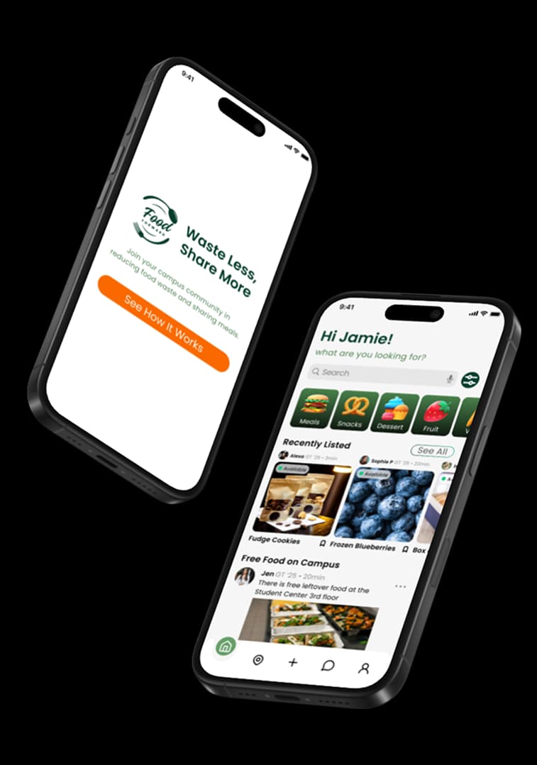
One in four college students experiences food insecurity while campuses trash good food by the ton. Food Forward connects the two: share surplus food, find what's free nearby. Ten weeks, from research to validated prototype.
The problem
01 / 06The project started as a food-waste idea and became a double-sided one: campuses throw away food that food-insecure students need.
How might we reallocate food wasted on campus to benefit food-insecure students?
Research
02 / 06I often buy more food than I can eat before it goes bad because I don't have time to cook regularly. It's frustrating because I feel bad about the waste.
The dining hall hours and locations suck, and it can be really hard to get food sometimes especially when I'm super busy or I'm on the other side of campus.
Sometimes I struggle to afford groceries, and when I can't buy food, I just end up skipping meals, which makes me feel more stressed and exhausted.
I'm so busy with classes that I don't even notice I haven't eaten until I'm too tired to cook, and then I just go to bed hungry.
Every interview circled the same tension: students care, but they have no time. Busy schedules cause overbuying and spoilage on one side, skipped meals on the other. A follow-up survey drew 50+ responses and confirmed it campus-wide.
I audited six existing campus responses, from the 5,000-member free-food GroupMe to the Klemis Kitchen food bank. Each addressed a slice; none fit student schedules, and the food bank carried stigma.
Of the three concepts we weighed, sharing won: it tackles waste and insecurity in one motion, and letting students meet on their own terms removes the stigma of asking for help.
Sketch to high fidelity
03 / 06One map of the flow, eight hand-drawn screens, a walkable low-fidelity prototype, then the high-fidelity pass with its warm, inviting visual system. Every screen had a job before it had a look.
Testing changed the design
04 / 06Every round of user testing cut or reframed something.
- Shopping cart → sharing
- The cart metaphor made the app read as commerce, not sharing. It went.
- Goals tab → live feed
- Users wanted real-time free-food updates more than our goals feature; a Free Food on Campus feed took its place on the home screen.
- Community tab → map
- A large campus needs a spatial answer: an interactive map showing free food in real time.
- Charts → key stats
- Profile charts were pretty but unread. Plain numbers replaced them.
The app
05 / 06Four things, kept deliberately simple: one feed for listings and live campus updates, a few taps to share food, a map to find it, and a running count of the food you've kept out of landfill.
Takeaways
06 / 06- Let research move the target
- The project began as a waste problem; research revealed the insecurity problem inside it. Following that is why the concept holds together.
- Prioritize before wireframing
- Next time, an impact-vs-effort pass before designing: several features we built and later cut would never have been built.
- Design for users, not assumptions
- The features I expected to shine (goals, data viz) tested worst; the map and live feed tested best. Validation beat intuition every round.